

Simply Said Logo Design
Simply Said seeks to create an inclusive space for open discussions about faith in Christ, free from judgment. Their podcast aims to encourage spiritual growth among believers, regardless of their background or location. The project focuses on developing a new brand identity that reflects these goals and connects with their target audience through cohesive color branding.

Smoothness
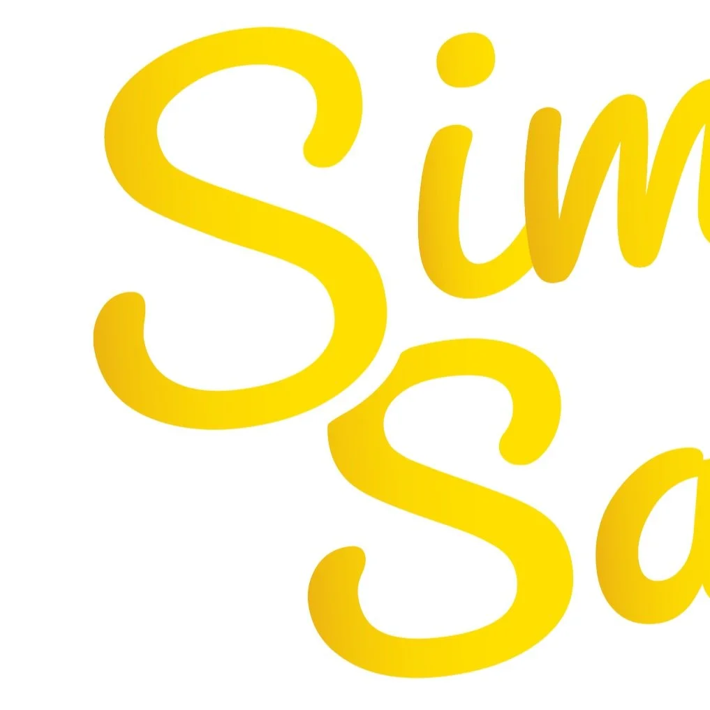
The typeface was designed to complement the brand, reflecting its smoothness while embodying a friendly and calming personality. This approach also emphasizes the brand's simplicity.
Typography
Transitioning from a cursive, smooth typeface to a bold sans serif brings a striking balance that elevates both typeface families. This thoughtful design choice not only strengthens our brand identity but also highlights the crucial "series" element, creating a cohesive and impactful visual narrative.
