

Rana Natural Rainforest Water Stationery Design
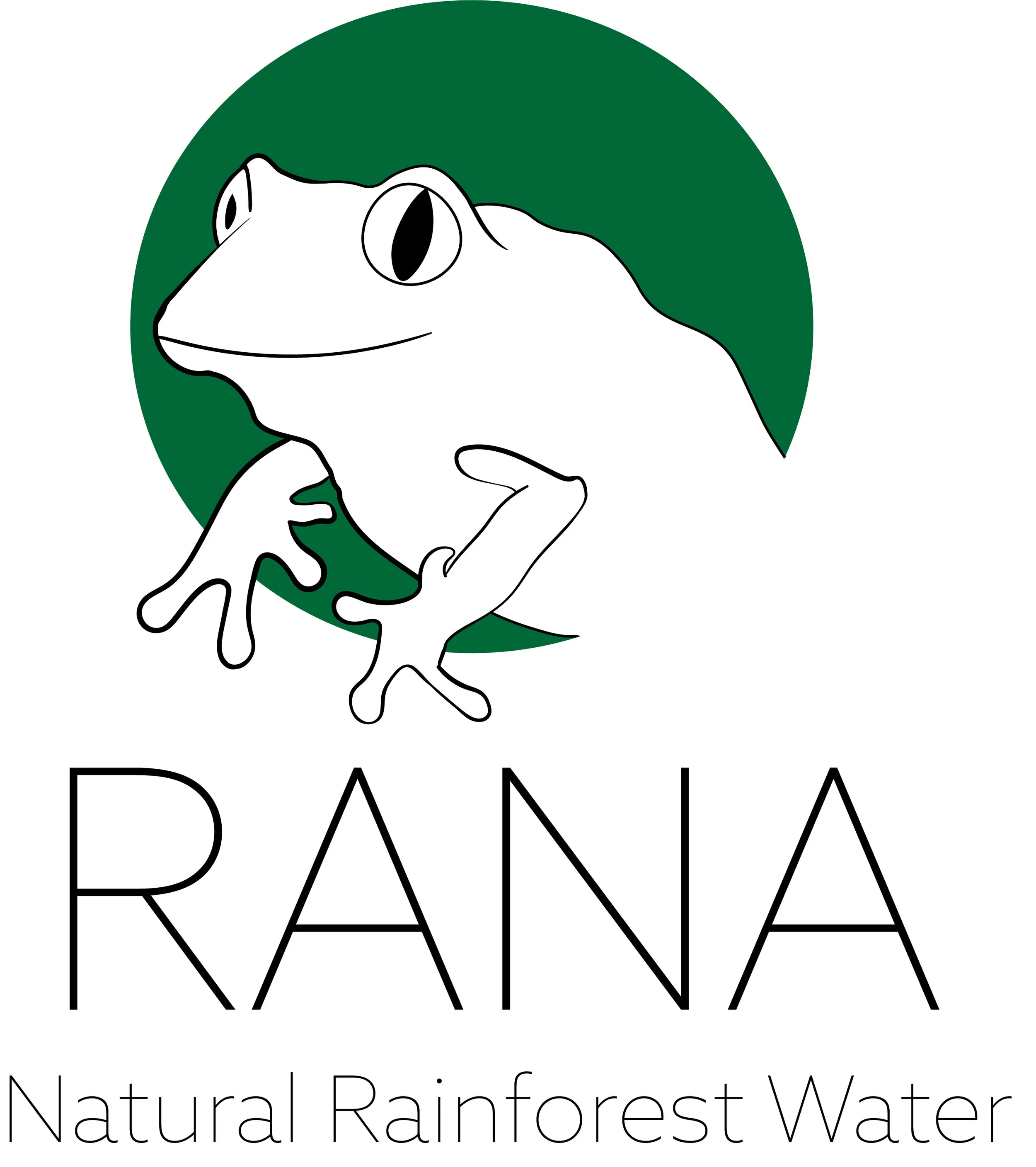
Rana Natural Rainforest Water is a drinking water company that aims to save all frogs in the rainforest. Every penny spent on the forest frog water is used to help the frog avoid stretching. The frog has used the main mascot of the logo, and earthy colors are used in the logo and stationery at the same time.
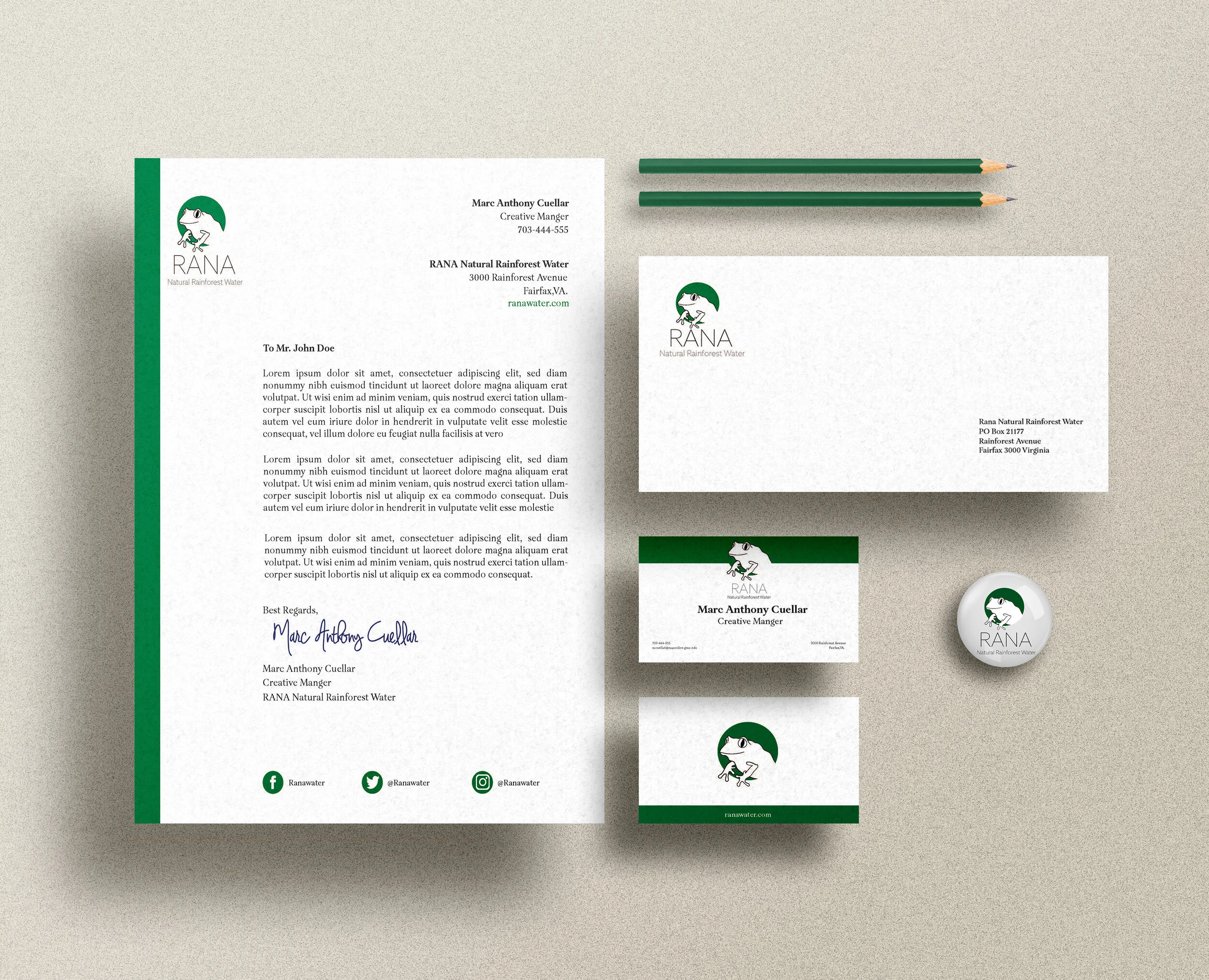
The goal of the company is in mind when creating the brand mark. I chose the brand’s mascot, which focuses on the frog, so Rana builds the brand. The color palette is green to connect both the colors of the rainforest and the frog. The hue green stands in front of the circle green without the frog, drawing attention to the frog and showing the frog’s environment. Rana’s name is an essential key to the company, for “Rana” is a frog in Spanish. Typography needed to be a thin sans serif font to give the audience attention to the mascot, and the company’s name. The stationery design is simple and carries attention to the green of the company and its identity.