EVO
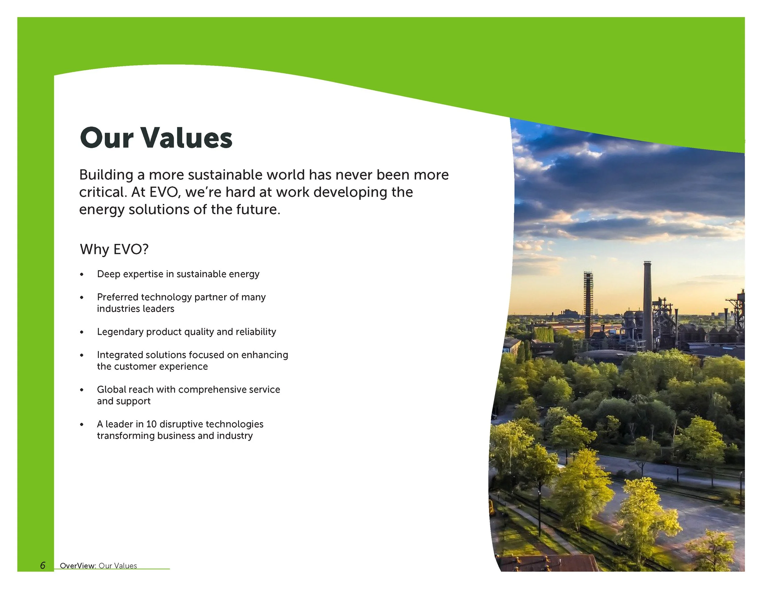
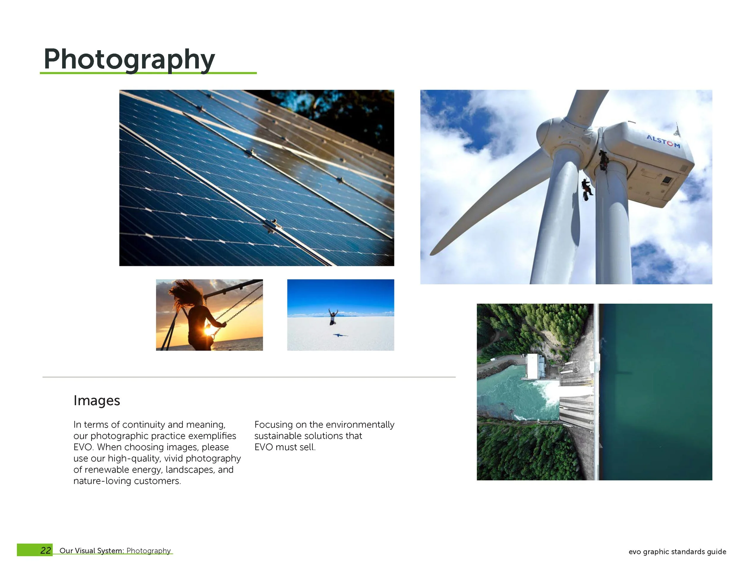
EVO is a power-saving company that’s primary goal is to create a more sustainable planet. Built-in 2021 aims to help you identify the company from the primary and sub-brand logos to the Print Collateral and Ephemera. Like the company, Evo created the brand to contain the company’s efficiency with the lively green colors that represent green energy.
Logo’s

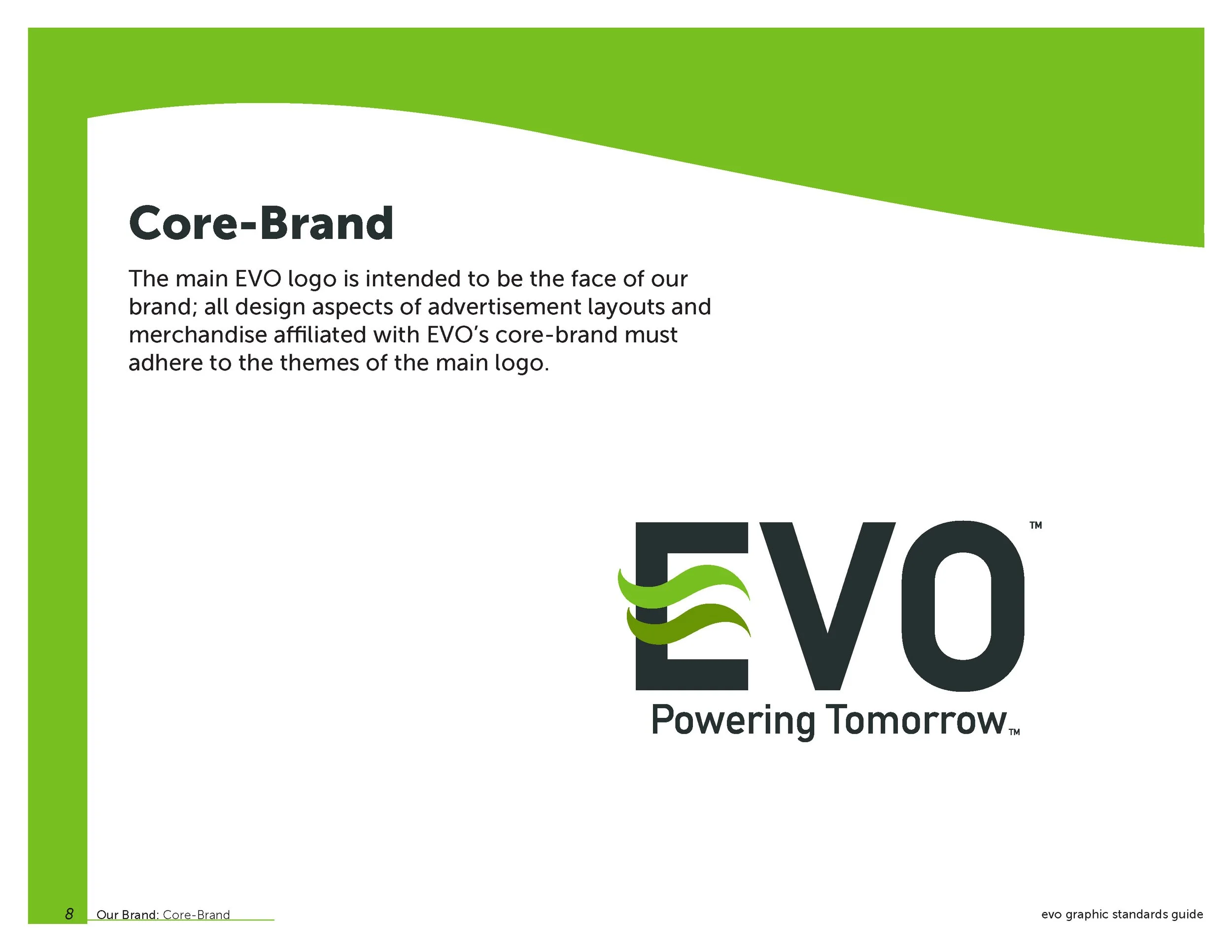
EVO’S Logo
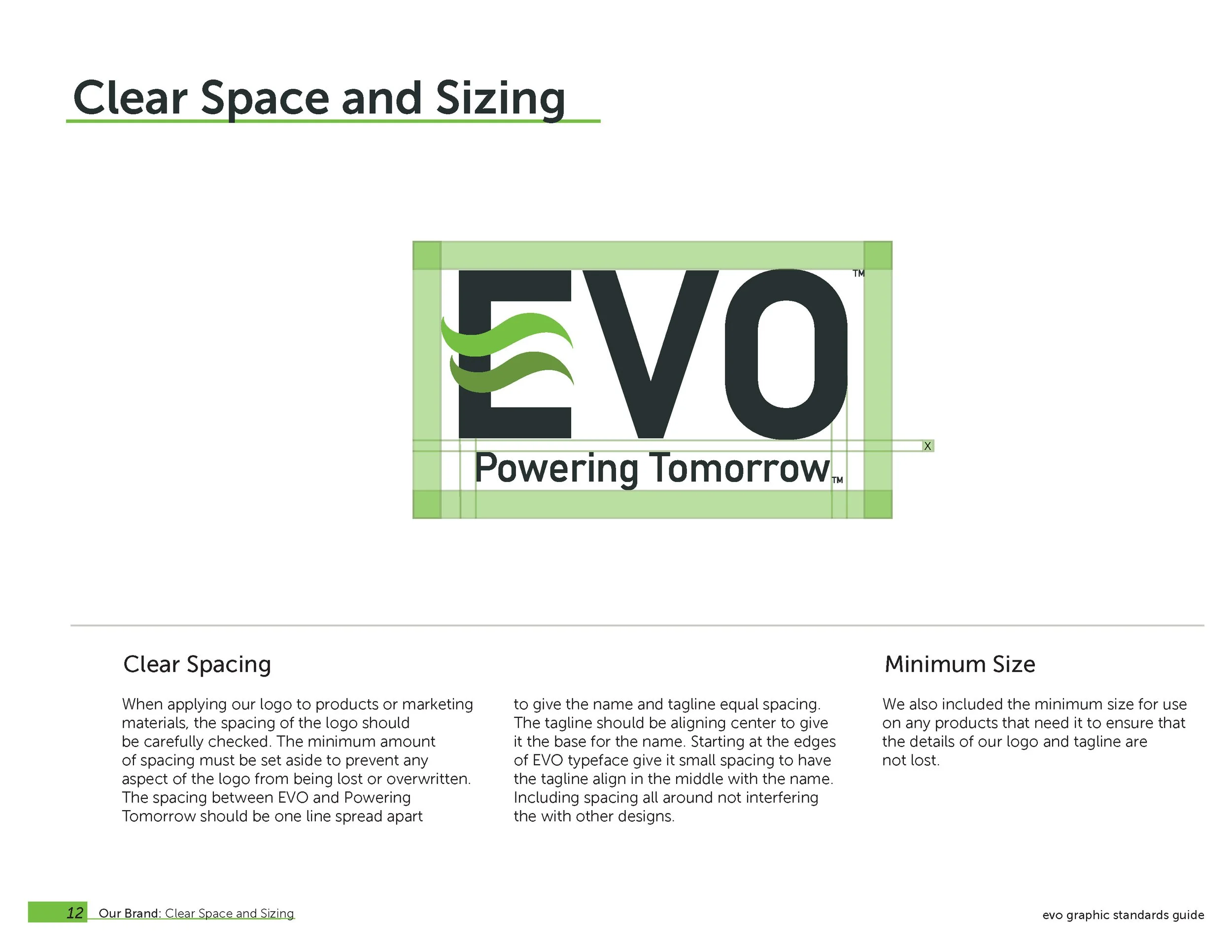
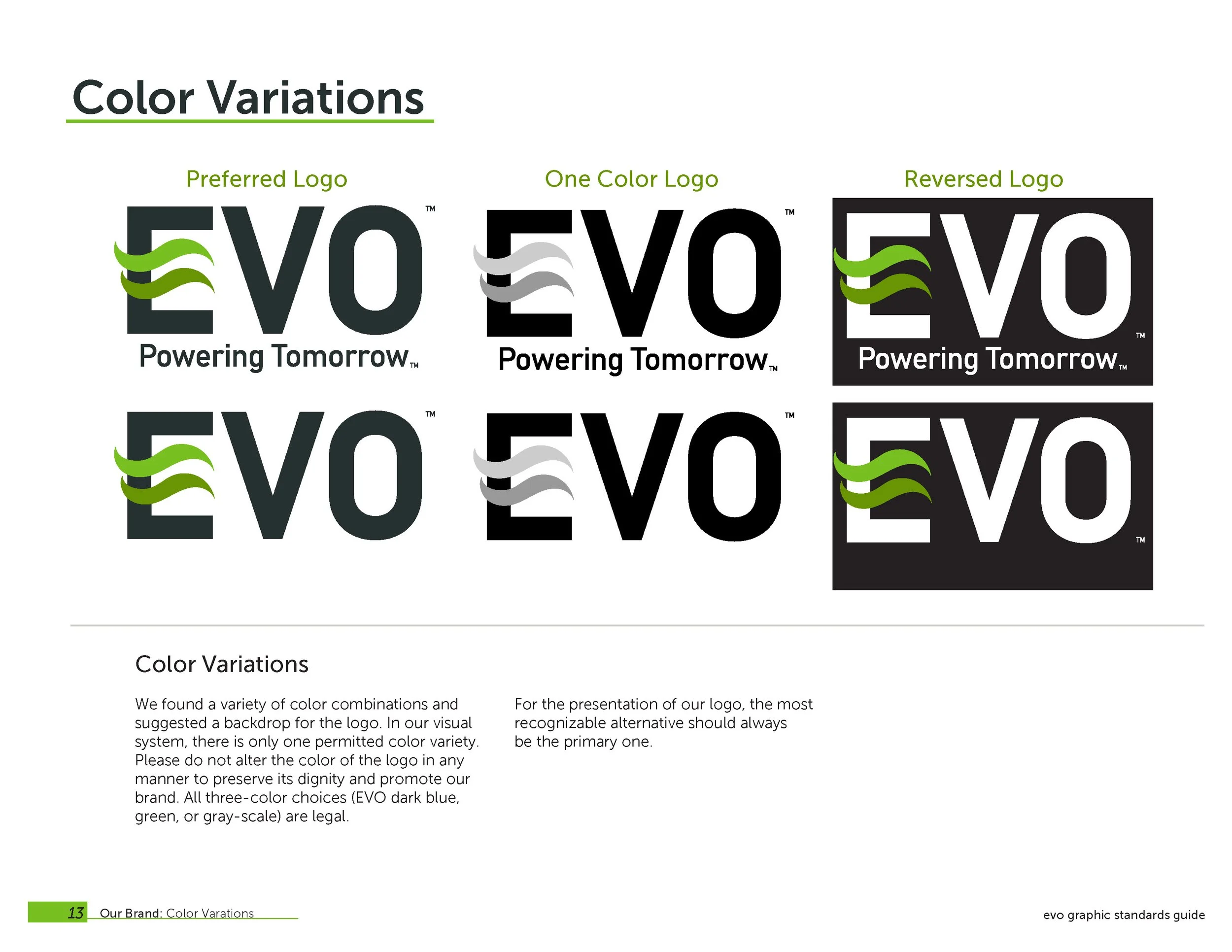
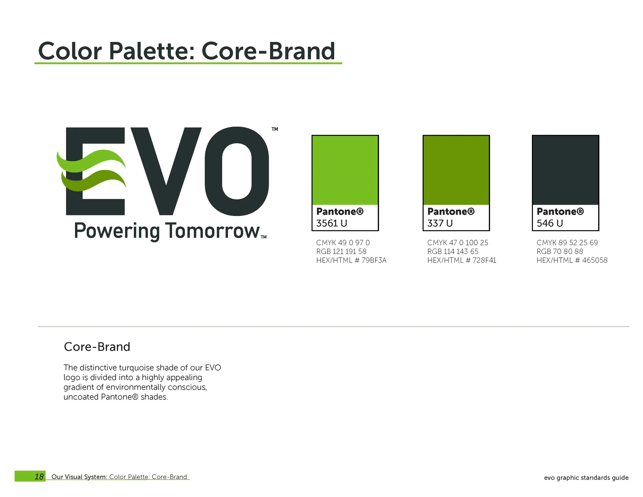
Our logo is a combination logo with a strong letter mark, representing a company, using outer space to represent the simple side, and giving an energy gradient. The two abstract wave colors represent waves in the wind or waves that give Lima green two different shades. Green represents the side of the brand on the earth, reminding people to pay attention. EVO must make our planet an energy-efficient world.

Subbrands Logo
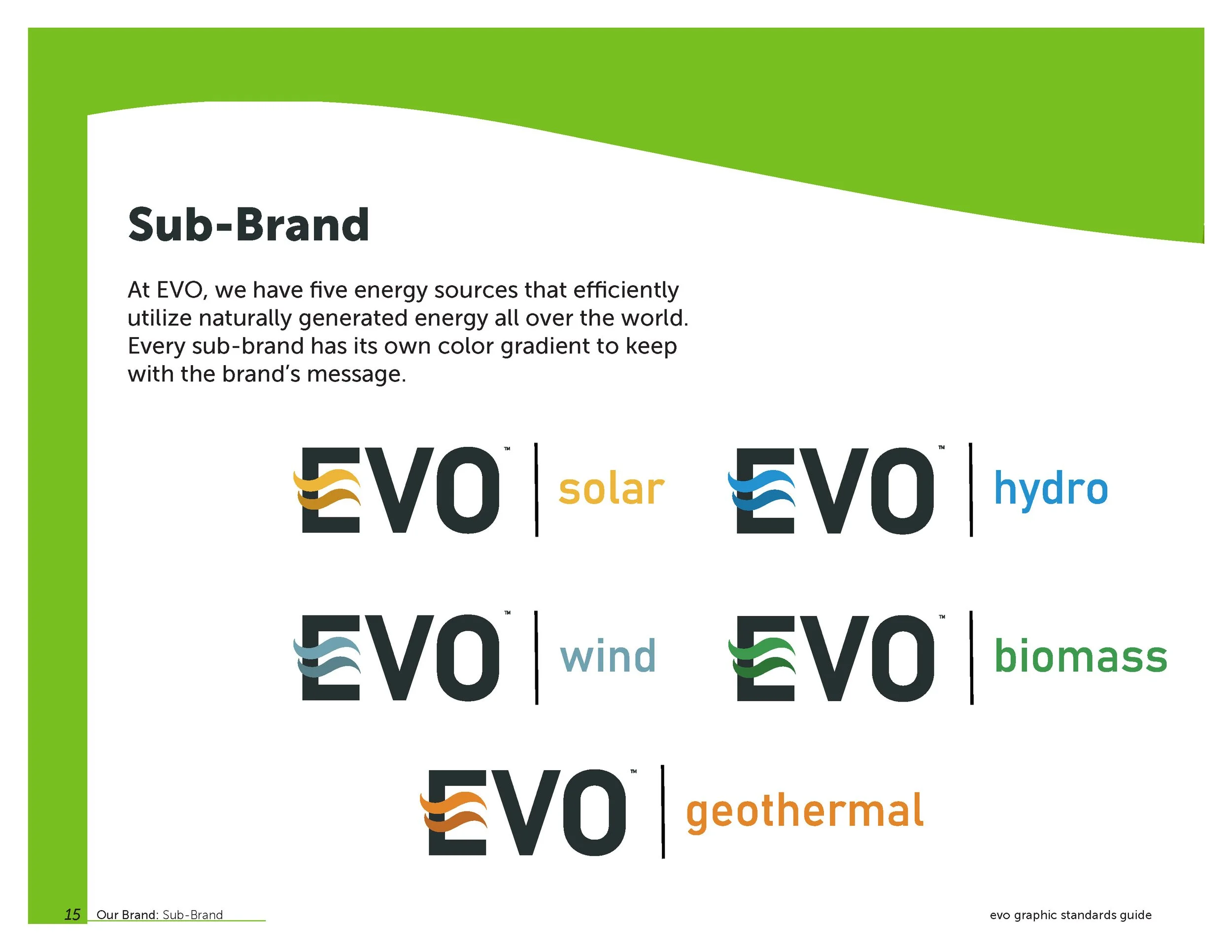
EVO has five types of energy, which can effectively use the energy produced naturally in the world. Every sub-brand has its color gradient to keep with the brand’s message.
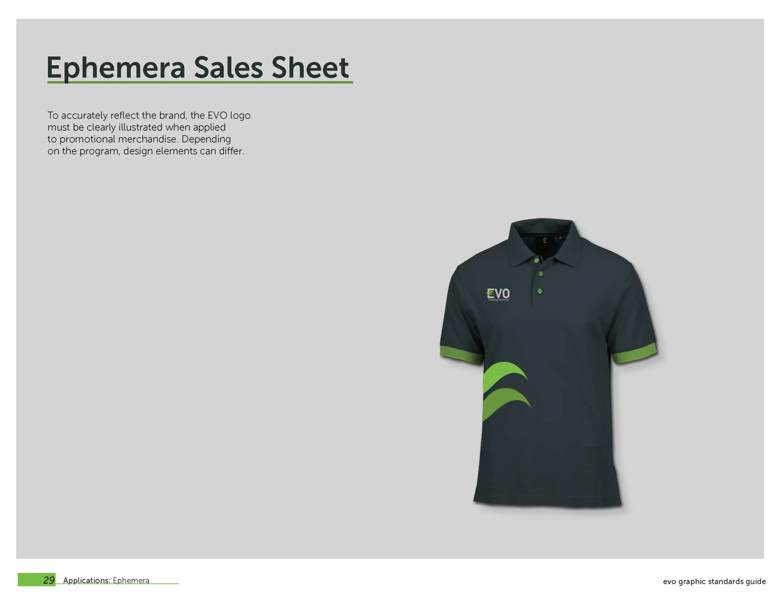
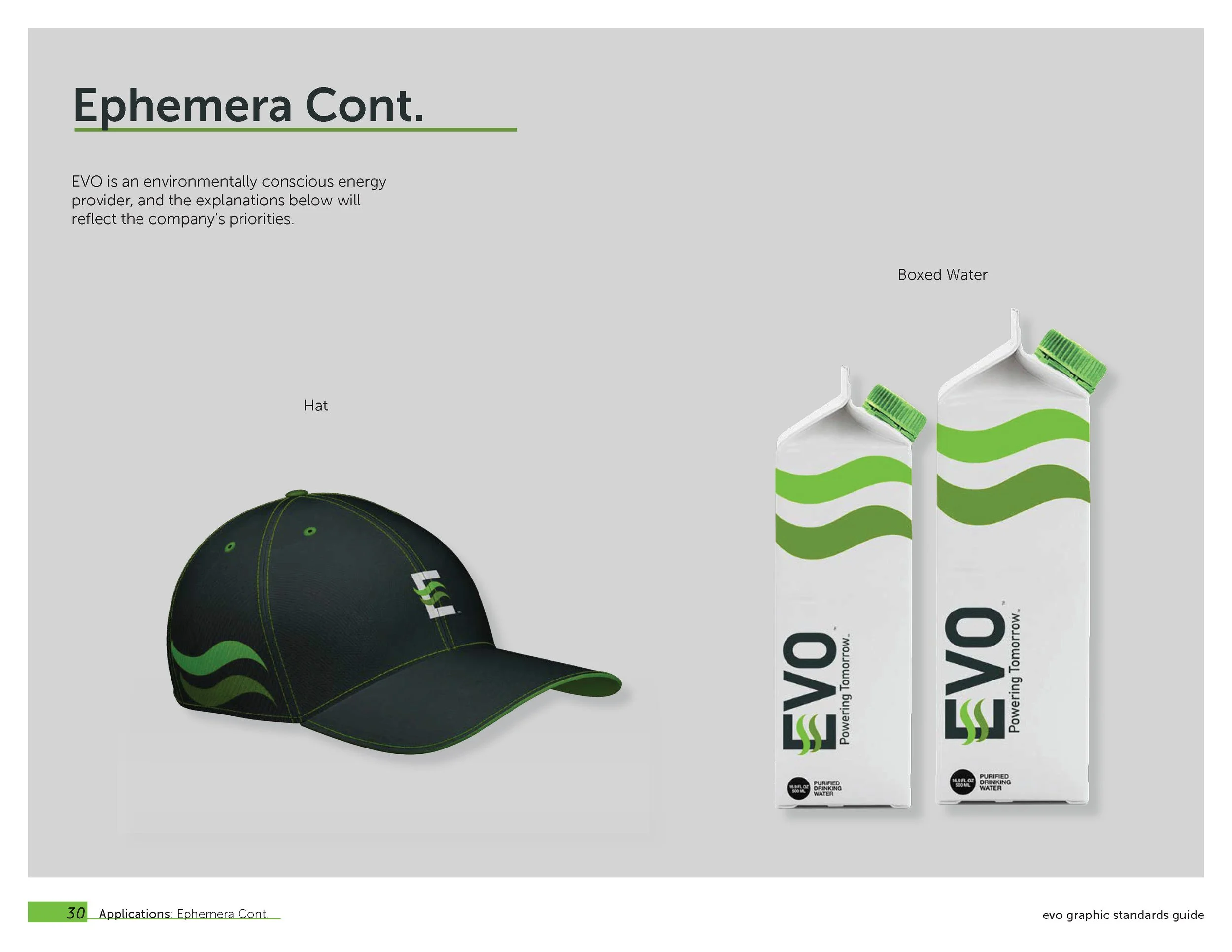
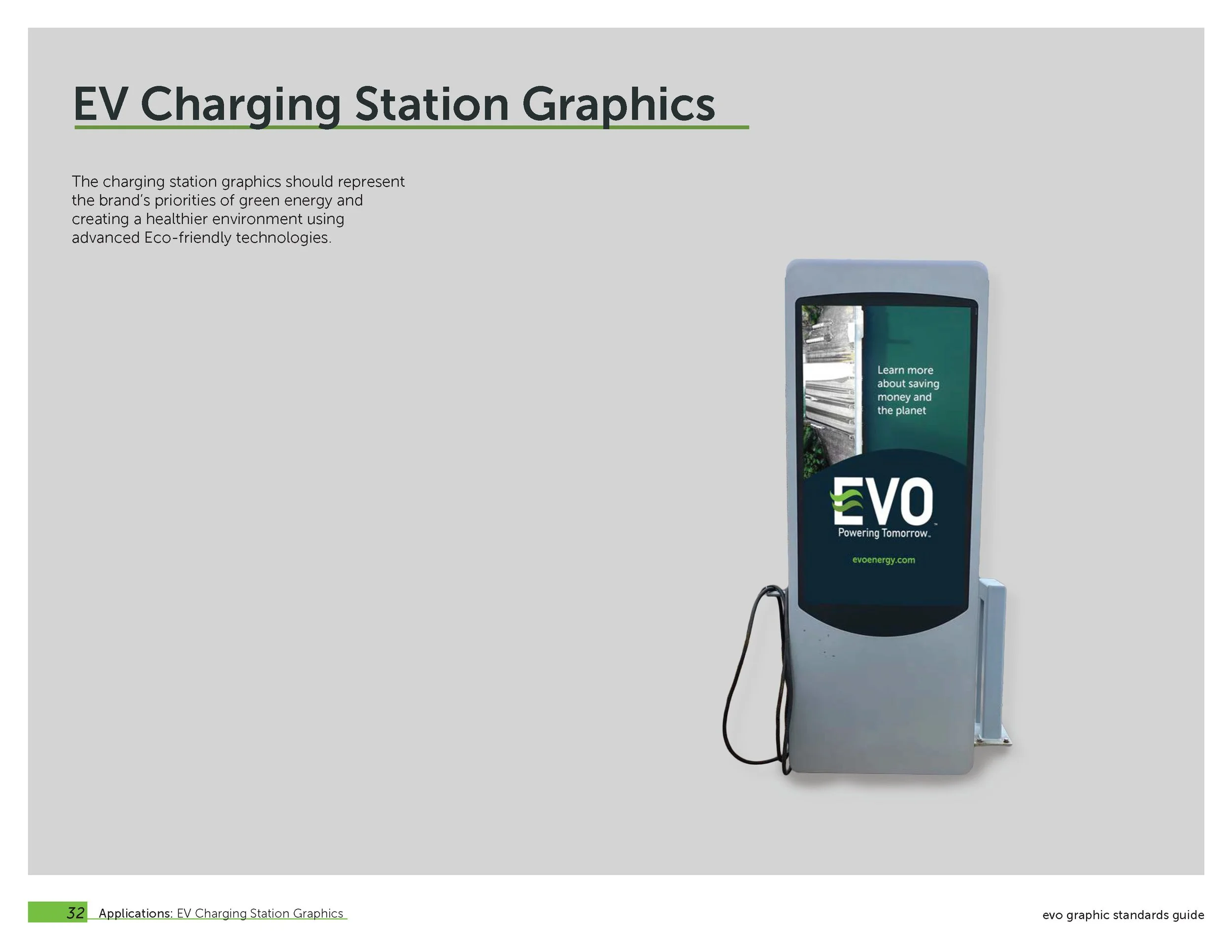
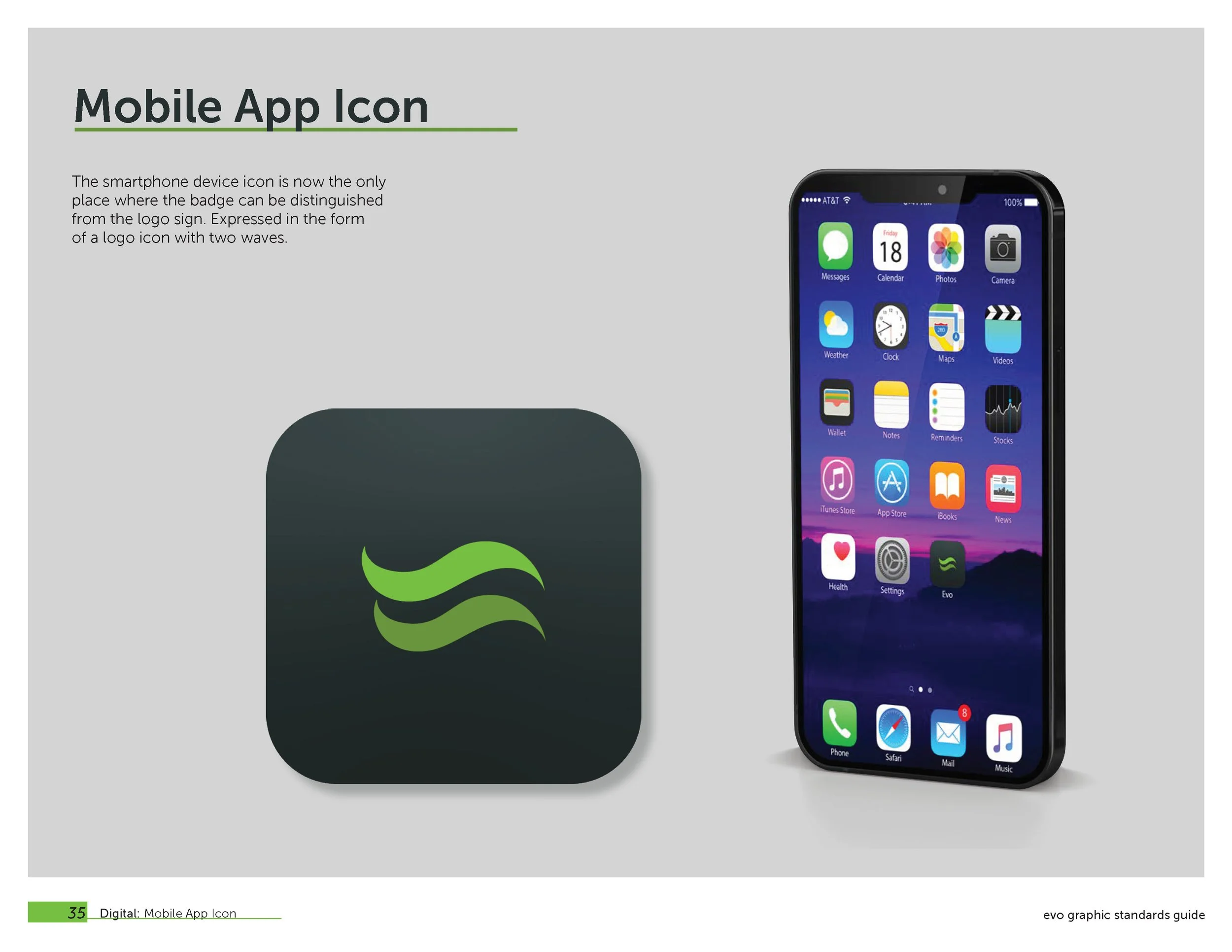
Evo's logo is designed on employee uniforms, vehicle packaging design, charging stations, recycled water cartons, and stationery. The charging station provides space to showcase other ways Evo can help save the planet. Evo’s brand logo allows the same color palette and theme while still containing the same environmental company logo that Evo pursues.
EVO’S Print Collateral

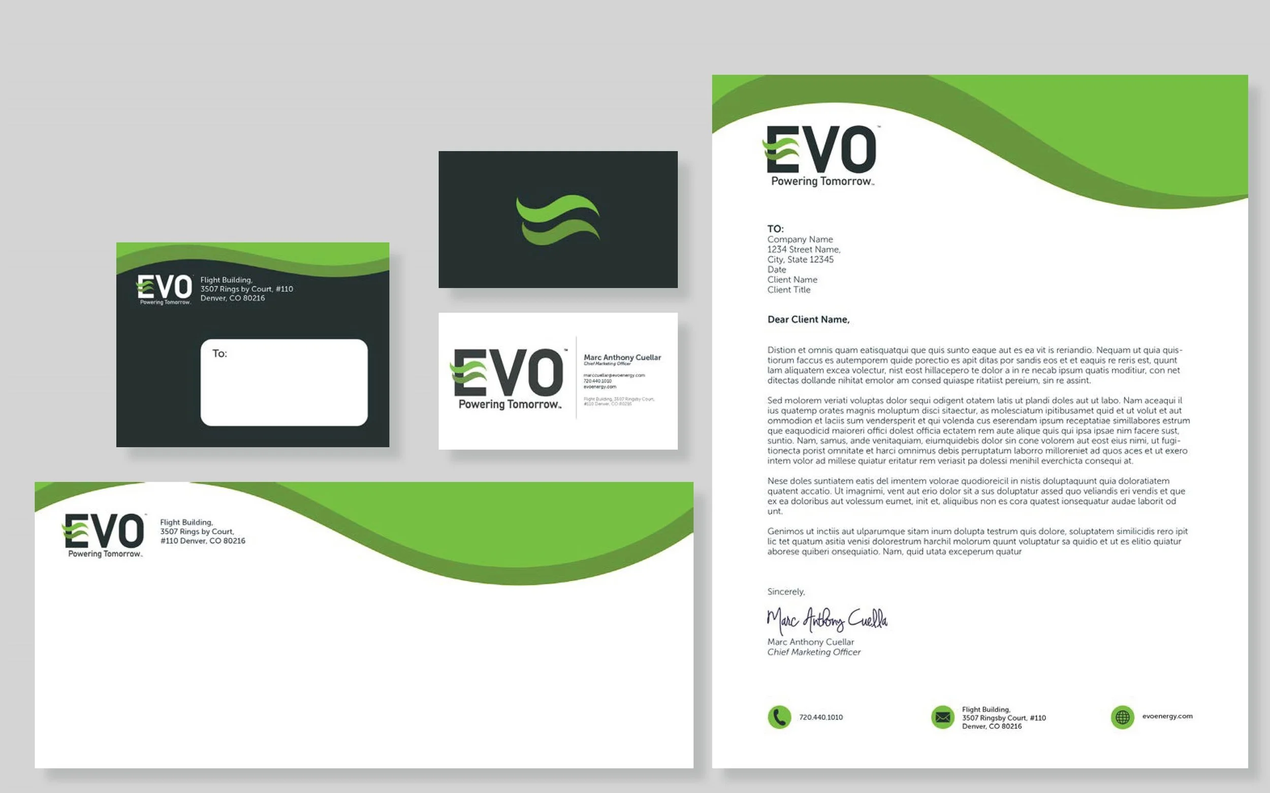
Business Stationery
Pocket Folder

Outside Pocket Folder

Inside Pocket Folder
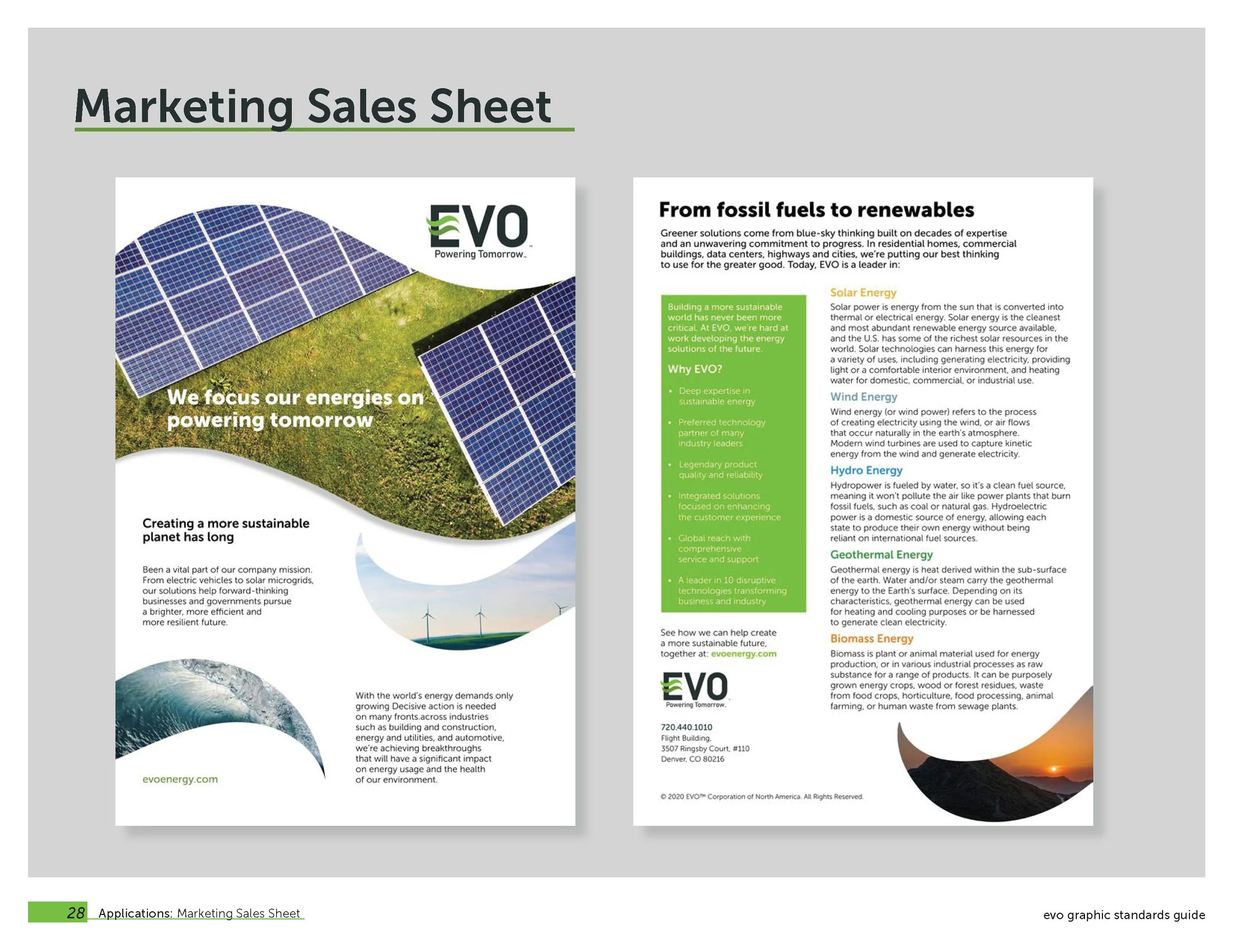
Marketing Sales Sheet

Front and Back
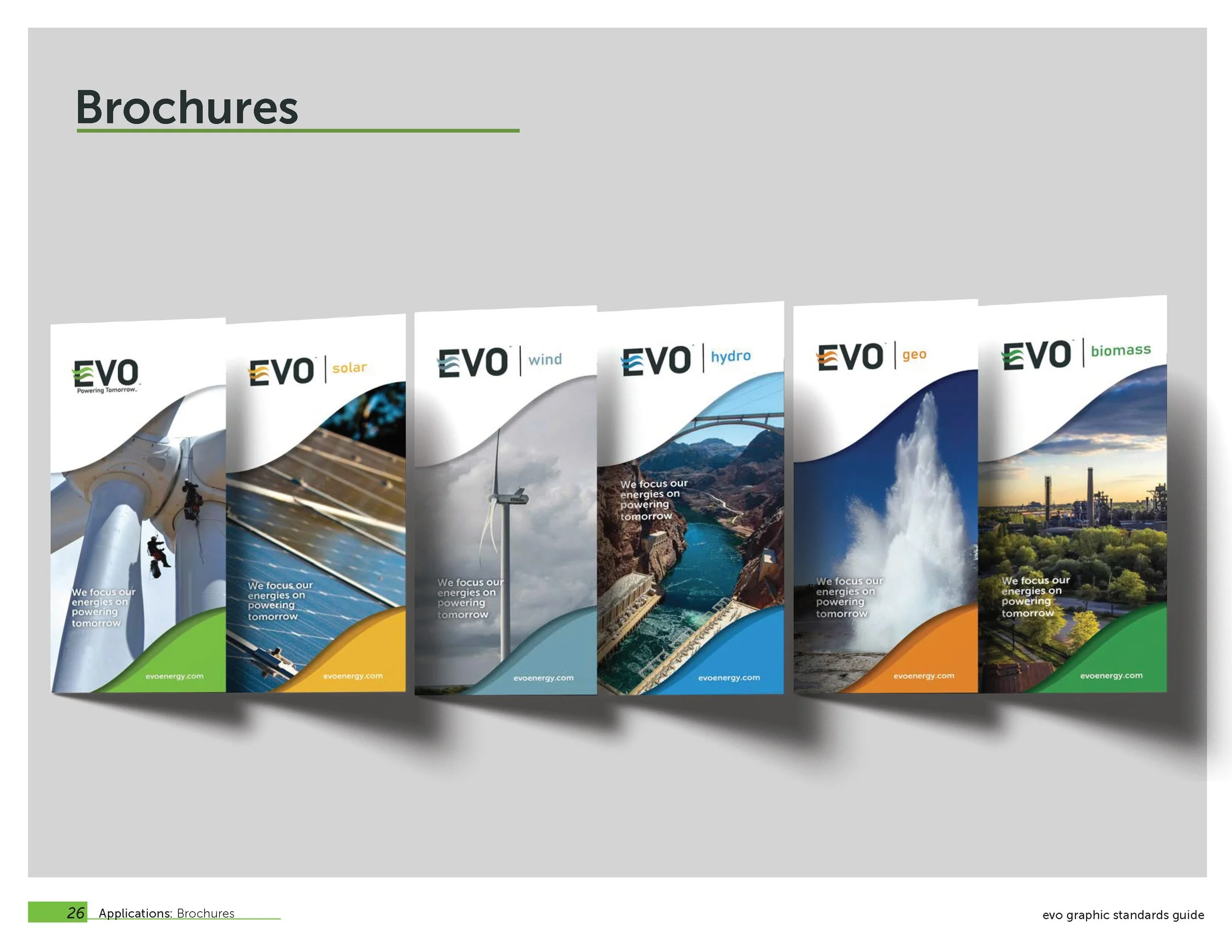
Brochures

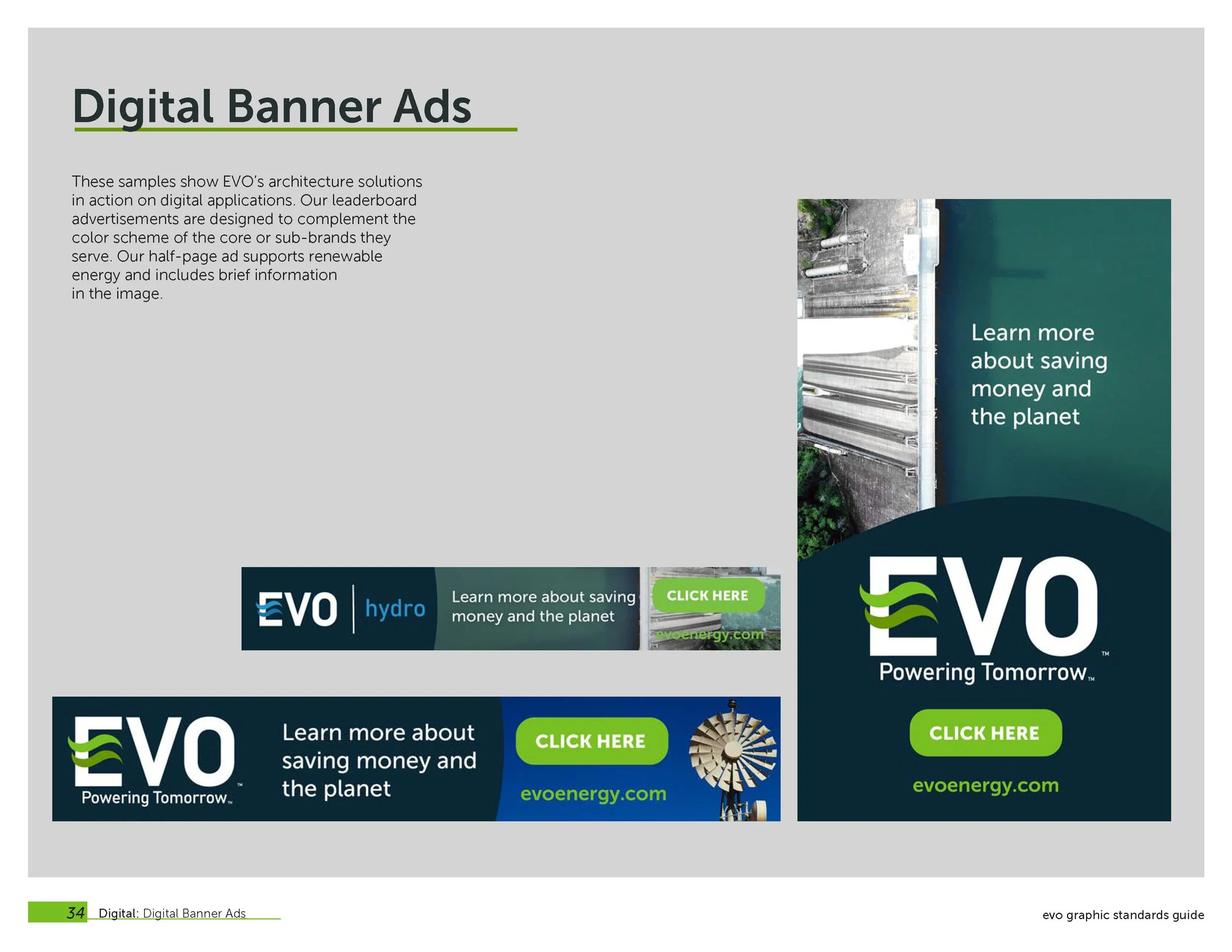
Degital Banner Ad’s

Ephemera
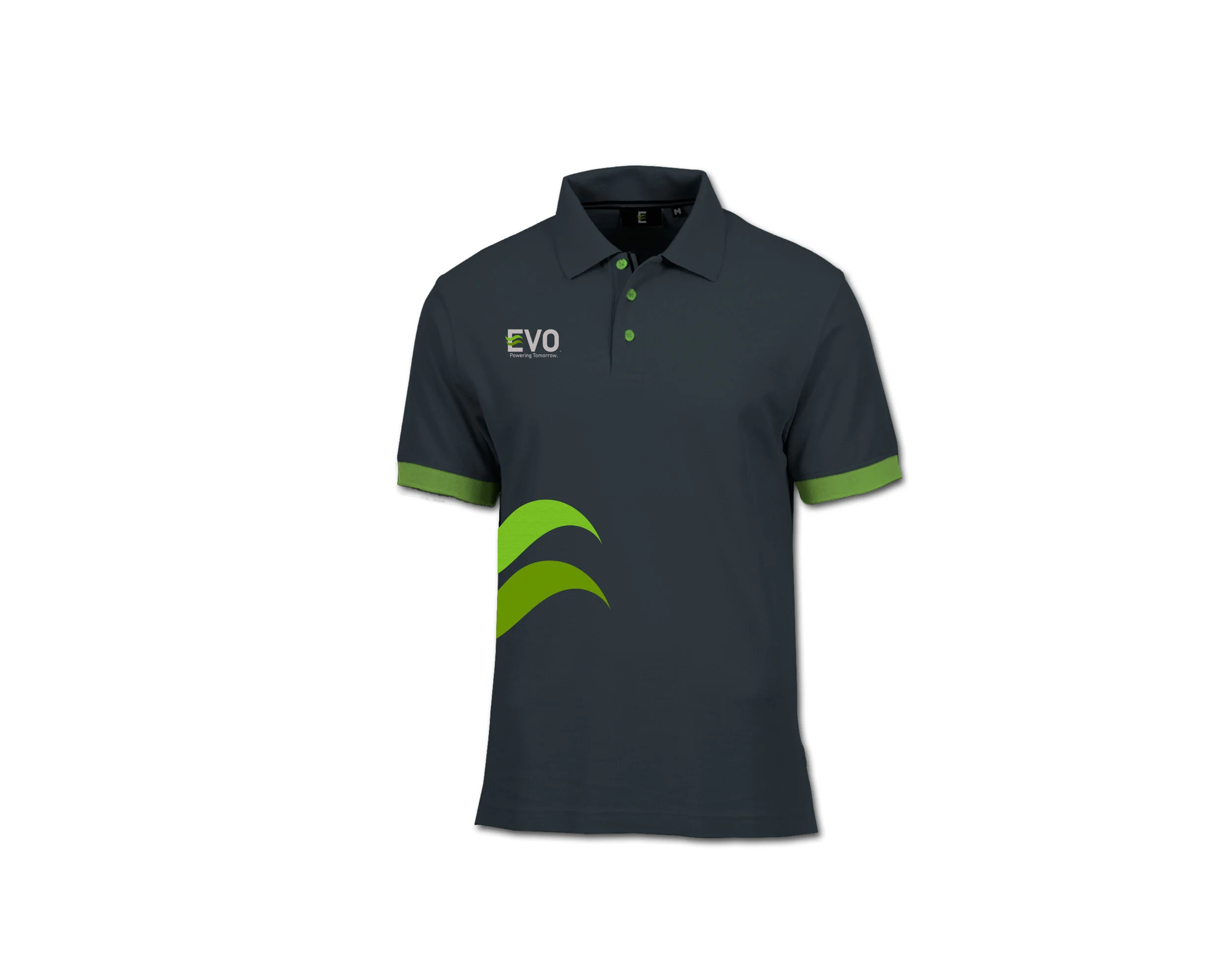
Employee Uniform
.

Employee Hat
Vehicle Graphics

Side

Back
EVO Graphic Standards Guide